All the data, all in one place
The latest, most powerful tool to find, visualize, analyze, and download community data.
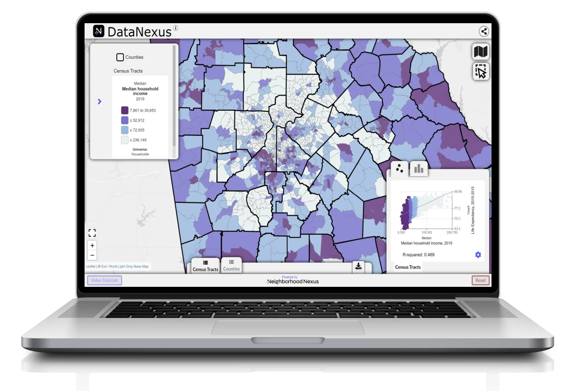
Thousands of easy-to-find demographic, education, health, and economic indicators from state and national sources, all in one place.
Explore statewide census tracts, zip codes, cities, counties, legislative districts and more.
Entirely free!
Go to the data ➞